Swander Pace Capital Website Gets A New Branded Look!
Swander Pace Capital, a private equity company for consumer packaged goods, needed new website hero animations.
I worked with their Marketing Manager, Amparo Calderon, to develop a branded look for each division of products that showcases and animates them for the viewer. We collaborated on art direction, set, and style to ensure that each product and division stands out as well as comes together for a cohesive, branded look.
The goal was to show the depth and breadth of their expertise across numerous consumer packaged goods categories. They also wanted to showcase many of the iconic brands in their portfolio. They wanted a bright, authentic look with a fun animation to highlight the most important brand for each group.
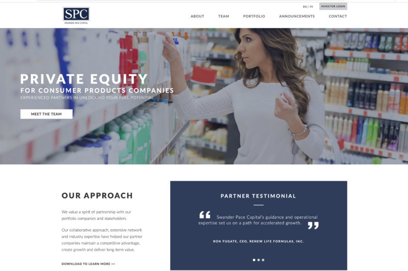
Here is the “before” home page screenshot with stock images. The group designed it together several years ago but now it is time to achieve an updated look.
The branding process with words, mood board, category, and test shots is shown here:


And here is a mockup of the “after” for the home page with the stop-motion videos:
And each asset, shown as forever-looped GIFs here (MP4s used on actual site and they play once with a poster image):


Check out their live site now at https://spcap.com
Art direction, photography, set design, product styling, photography, and animation by me, Judy Doherty, collaborated with SPC Marketing Manager, Amparo Calderon. The SPC website was coded by Robert Noakes.
Shot in my new studio in Castro Valley, using Phase One, Capture One Pro, Photoshop, and After Effects.
Recent news: