
James Porto has a reputation for presenting fantastical worlds that blend real and unreal together through the use of classical photography techniques and digital compositing. The resulting images, rich with texture, often challenge the viewer’s sense of reality.
James’ early influences, experimental artists like Jerry Uelsmann and Pete Turner and the classical portrait and fashion greats Irving Penn and Richard Avedon, are always palpable in his photography to one degree or another and are ultimately what make for two distinct sides of his artistic sensibility.
Scattered throughout his images one can find unusual, unexpected, and evocative ideas usually inspired by dreams, fantasies and even music. Conversely, viewers can also expect to see work that captures the majesty of a moment or the essence of a portrait subject, images that are more classical and restrained.
An energetic, conceptual thinker and problem solver, Porto always takes responsibility for every aspect of the process, from pre-production to delivery. This way he can better control the outcome and realize the exact vision that he imagines and that an art director is hiring him to create.
James’ latest assignment, The Real Cost Campaign¸ is part of the FDA’s Nationwide Anti-Smoking Campaign, and is currently running in most major markets across the country as large posters in transit stations and subways.
We caught up with James to get all the details of this powerful new project and discuss more of his imaginative, multi-layered work.

The Real Cost Campaign © James Porto
How did you get involved with this project and why did choose to take on the assignment?
The Creative Team at FCB/Garfinkel in New York, Senior Art Director Jackie Anzaldi, Art Director Mike Lubrano and Executive Vice President/Executive Creative Director Gary Resch reached out to my agent Ralph Mennemeyer as they felt my vision would match well with their concepts, which were epic. I wanted to take this assignment on because it presented an opportunity for me to create images that would make a positive difference in the world. I found it impossible to pass up making graphic, iconic and frightening posters aimed at countering and discouraging the insidious intentions of the tobacco industry which are to ensnare young people with their evil and addictive product.
Does it have any personal relevance to you?
I’ve never smoked tobacco, however, I’ve watched too many of my friends struggle with the enormous challenge of trying to quit, some with success and others not. During the course of making the images for this campaign, Tom Sales, my childhood friend and a lifelong smoker, died of lung cancer. I dedicate my contribution in this campaign to his memory.

The Real Cost Campaign © James Porto
Those monsters are gruesome – and awesome! Who created them? What do they represent?
Yes, I agree. The monsters were created by Legacy Effects out of LA at the direction of the FCB team. Seriously the best special effects team I’ve ever worked with; we were in the studio absolutely freaking out at these terrifying creatures. They had actors inside the costumes and there was goop dripping all over them… yuck! The army of monsters represents the 7,000 chemicals that constitute contemporary tobacco products. Imagining that you’re inhaling those evil creatures instead of smoke may give some people second thoughts about either starting to smoke or continuing to do so.
The overarching goal of this campaign is obviously to communicate the dangers of cigarette smoking to young adults. Did you have any personal goals for this project?
My personal goal was to make images that were so terrifying and intense that they would be impossible to ignore, and that their presence in the civic landscape would begin to create a shift in consciousness and awareness around the lethal risks of tobacco use. If even one person were prevented from smoking from these ads I would consider it successful.
Tell us a little more about your shooting and post-production process for these images.
It was a long and ambitious single day shoot as we not only shot the stills for the print campaign, we also did a complete video production with each of five individual monsters as well as a group shot. I kept the lighting dramatic and had the video team match our look. We shot them with and without smoke swirling around them so it was quite a few variations in two mediums and we somehow pulled it off. Once that was done we had 4 luxurious months to create the composite images. I always prefer more time if it’s available, that way each composition can be finessed like a painting to achieve its maximum power and effectiveness and in this case I was very satisfied that we reached that goal. I am very grateful to both FCB and Legacy Effects for a rare and satisfying experience.
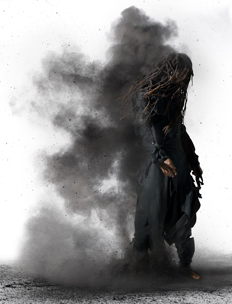
Powder
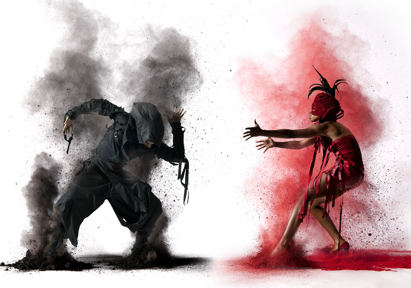
© James Porto for Blacksnow Conversions
These images were a collaboration with Blacksnow Conversions. Tell us more about the client, their vision for this shoot, and how the images have been used.
Blacksnow is the enigmatic duo of Micah Blacklight and Opie Snow, two versatile artists whom I met at Burning Man. We collaborated to showcase their costume design so all the styling is theirs. As this was an artistic collaboration it unfolded very organically without the normal client-artist hierarchy; we worked together seamlessly with them creating the look and me capturing and directing the action. I am always on the lookout for an element that visually inspires me and that I haven’t worked with before, so I started to experiment with powdered pigment and the Blacksnow collaboration perfectly fit the bill. As of now these images have only been used for self promotion; I consider them some of the most successful images that I’ve produced recently.

© James Porto for Blacksnow Conversions
What kind of challenges did you face with this project?
I wanted the final image to look perfectly photographic and it took a great deal of time and effort to achieve that result in post production because the powder is so fine it is almost impossible to mask and composite without it looking like amateur Photoshop hour.
© James Porto for Blacksnow Conversions
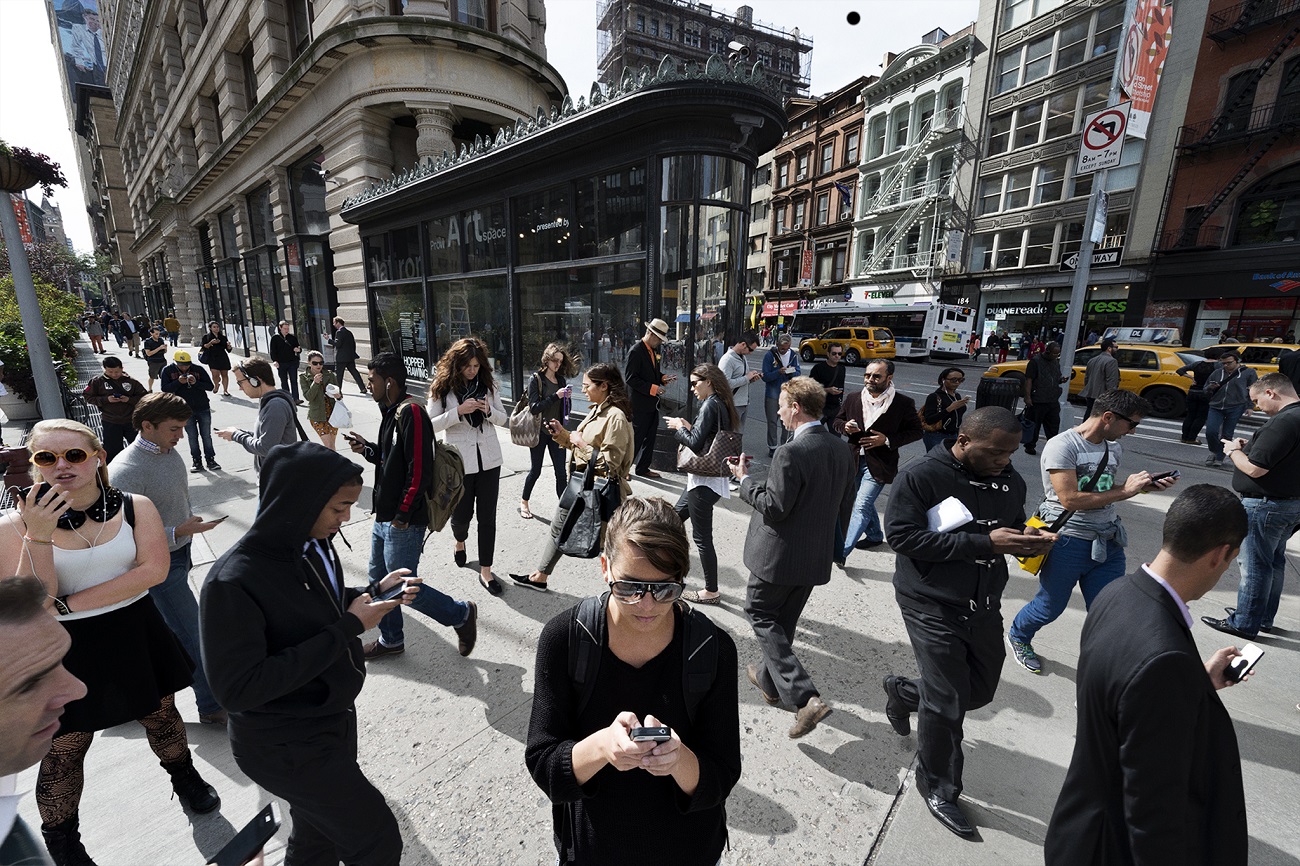
Overload

© James Porto
Was this a personal project?
The idea for the Overload series arose from several provocative magazine assignments from both Wired and New York magazine and has transformed into a personal theme that I keep coming back to. Due to the monumental complexity and ambition in each image, there are not that many in the series yet; each one tells a different story of how our world is evolving and morphing with the onslaught of technology, advertising, and population in our hyper-speed information age that we all find ourselves in.
© James Porto
Where did the concept come from?
Back in 1997 Wired assigned me to do a picture set in Times Square where all the signs were changed to a single advertiser. It looked amazing and going forward, I kept looking for opportunities to utilize that device; New York magazine gave me several assignments based on that original Wired image and each one was very successful. I then did a few more as personal projects and currently have several more in progress.
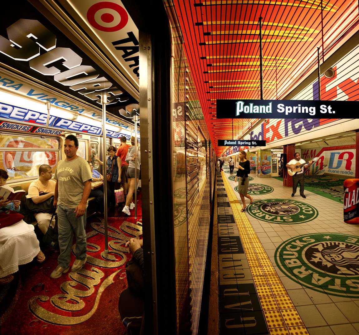
© James Porto for New York Magazine
How did you create the final image above?
Quickly! Randy Minor of New York Magazine called me one day and asked if I could create an image that would exaggerate the result of the MTA’s recent decision to offer advertising space in the subways that was previously off limits, but I only had 36 hours. I accepted and went right out with my camera, riding the subways until I felt I had a thorough library of background images and figures to work with; meanwhile my assistant gathered logos. Then it was caffeine and compositing until I arrived at the image you see here, delivered 30 minutes early too!
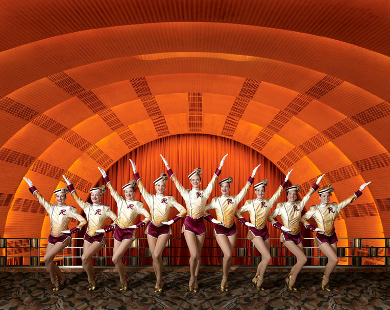
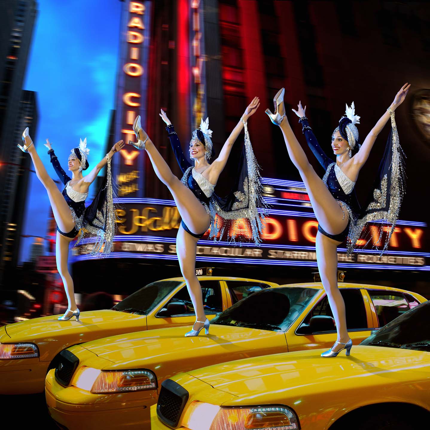
The Rockettes 75th Anniversary Book

© James Porto
How did you come across the opportunity to photograph the Rockettes?
Very luckily, my accountant’s wife worked for Madison Square Garden and otherwise may not have known of my work. She along with her marketing director called me in for a meeting where they asked me to create a proposal to shoot a book for the 75th Anniversary of the Rockettes. What an opportunity! I was thrilled when they accepted the bid and gave me the job!
© James Porto
Radio City Music Hall and the Rockettes are undoubtedly two of the most iconic attractions in New York City. Pictures of, and about, them are innumerable. Did you see this as an obstacle when setting out to shoot this project? How did you prepare to overcome that?
Since this project was a retrospective celebrating 75 years of the Rockettes, we had access to their entire inventory of costumes going all the way back and had complete run of Radio City Music Hall for two full weeks, in addition to over 70 beautiful dancers and dance coordinators. I have always loved Radio City Music Hall and was so excited to have all that access and resources that I actually never considered what had been done before; I came into project with the intention to make exquisite pictures that would honor the legacy of both the Rockettes and the Hall and did so by visualizing the images as if I didn’t know anything about them, just responding to the visual possibilities that were right before my eyes.
© James Porto
We love these images, which are so perfectly executed that it’s hard to tell if any compositing was done or not! How much photo manipulation was involved?
What was different about this project compared to most of my assignments is that almost the entire book was straight photography; we created lines of Rockettes in various vintage and contemporary costumes, lit and shot them in various numbers in all the iconic locations throughout the hall with no manipulation. Interestingly, the three you chose were the only three composites in the book. The Marquis shot is certainly a composite as the women are out of scale, and would not have been permitted to stand up there, although we did try. The Rockettes were shot on a stage and it’s a simple two image composite. The Cover shot (orange one) had to be composited because there wasn’t really a place for them to stand and get that effect; the carpet and balcony were added and the stage façade was shot separately and composited to provide room for the title, etc. The taxicab shot is a total composite, which is more typical of my work and is pre-visualized; every element was shot separately and intentionally to serve the concept.
Special thanks to James Porto for taking the time to collaborate with us on this interview!
James Porto is represented by Ralph Mennemeyer. You can explore more of his imaginative work through his AtEdge Portfolio and website.